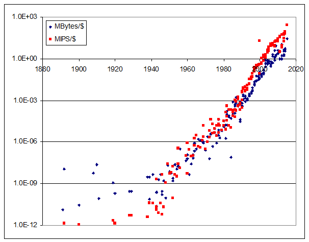
For almost 30 years, roboticist Hans Moravec has been maintaining a great database of historical computer benchmarks going all the way back to 1891 (even before Hollerith tabulators).
This can be used to make nice plots showing Moore’s Law like this one (source XLS here):

But – here is something way more interesting.
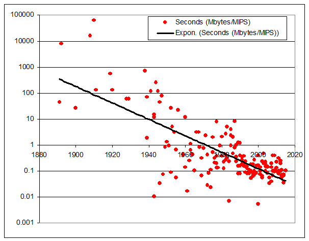
The graph below plots, for each historical machine, the ratio of RAM (megabytes) to MIPS. So a machine with the same bytes of RAM as instructions/second rates as 1. One with 10x more bytes of RAM than instructions it can execute in a second rates as 10, etc.
I think of this ratio as “seconds” – if each instruction can access one byte, then the ratio gives the number of seconds needed to access all the RAM. (Of course this is a rough measure, as architectures differ, but good enough to give interesting results).
Here’s what I get:
Look at that!
These are real historical machines with the given installed RAM (not how much RAM the machine could address, but the amount the machines actually had installed).
I’m just plotting the ratio of installed RAM to execution speed – it has nothing to do with price (except insofar as price may have affected buying decisions).
The ratio of RAM to machine speed has been steadily dropping. Why?
I remember a rule of thumb, probably from the 1980s, that a practical computer typically has about 1 second of of RAM – that is, a typical machine is fast enough to access all its memory in about 1 second.
This made sense at the time based on the idea that, in a command-line driven system, one second was about as long as users were willing to wait for a response. Longer was too slow, and shorter didn’t gain much.
But this graph is illuminating. The only explanation I can think of is that with the gradual transition from batch computing (many minutes is an acceptable run time), to interactive command lines (seconds) to GUIs (tens or hundreds of milliseconds), the ratio of RAM to MIPS has been steadily dropping.
But if that’s correct, I’d expect more in the way of a step function.
I suspect it’s something else, and that it’ll keep going. Something more interesting. But what?


Maybe there is a step function: before 1950, most of the dots are substantially above the line; from 1970 to 1990, the dots are spread out both above and below the line; after 1990, the dots are clustered much closer to the line.
I wonder if the dots above the line from 1970-1990 are mainframes and the dots below the line are minicomputers (which would be more likely to be used with command lines).
You’ve plotted a line. What if you tell Excel to plot a higher-order curve?
I invite you to download the XLS.
There you can see which machines are which. As well as play around with the numbers yourself. If you find something interesting, please post!
I think the trend has to do with a combination of how much memory is needed to accomplish the typical tasks to the level of detail demanded by the mass consumer market, and how much processing power is needed to accomplish that. I think the trend has been that beyond some point for the majority of applications, more usefulness is enabled by more complex computing & faster processing of chunks of data, rather than by the availability of more high-speed data access. Thus, it is sufficient to have gobs of slow-access storage (disk-drives, network, internet) and enough high-speed RAM to buffer that while doing more complex computing operations on that data. We’ve reached the point where we can access data faster than we can figure out how to process it usefully; thus, the value of MIPS is trending to be more valuable than RAM….unless you’re talking about niche applications – there’s always exceptions on the edges of bell curves.