Archive for category Sad

Slow-motion rocket videos shot with Nikon J1

On July 7 I shot some video with the Nikon J1 of the joint CMASS/MMMSC launch at the Tuckahoe Turf Farm in South Berwick, ME.

After my generally scathing review of the camera (more for missed opportunity than anything else), I figured I’d give it a chance to show what it can do with high-speed photography – specifically, I wanted to try the 10 Mpixel 60 frames/second mode as well as the 400 and 1200 fps high-speed video modes.

Here is the result:

I put it together in Sony Vegas. The blurry clips were shot at 400 frames/second (240×640 pixels). The blurrier ones are at 1200 frames/second (120×320 pixels). The video is at 30 fps, giving 1/13.3x and 1/40x speed. This video shows the full resolution output by the camera.

(To be pedantic, playback is at 29.97003 Hz (that’s 30000/1001); from what I saw in Sony Vegas, the Nikon actually records at 399.6004 and 1198.8012 fps – which makes an odd sort of sense if you know NTSC.)

As you can see, all the video is lousy. It’s poorly exposed (despite some fixing in Vegas), heavily overcompressed (in-camera) and oversharpened (again, in-camera). The 1200 fps mode is worse than the already bad 400 fps mode. You can’t control it. I don’t blame Nikon too much – the high-speed Casio cameras seem to have similar problems. On the plus side, most of the video was shot at a shutter speed of 1/5000 second, which is neat to do. A couple clips were at 1/10,000th (!).

The video is good enough for some technical purposes, but it’s not a joy to look at.

Finally, you’ll note that none of the clips are at that fantastic, promised, 10 Mpixel resolution (60 Hz). It turns out that although the Nikon J1 will record stills that fast (for 1/2 second), you can’t control the shutter speed while it’s doing it. I didn’t know that until I got there and tried it. The shutter speed it picked (on a reasonably bright day) was so slow that each frame had lots of motion blur in it. So I didn’t bother. Just another needless firmware-based disappointment from the Nikon J1.

I’ve put the camera and lenses up for sale on eBay. Such a shame, Nikon. Oh well – I’m getting excited about the rumors of the new Canon mirrorless ILC system; maybe they’ll do better.

A nerdy review of the Nikon J1 camera

The Nikon J1 is unique and wonderful and frustrating and stupid. All at once. It’s the bastard child of a brilliant engineer and a retarded UI designer. It’s the best digicam ever built for using classic and exotic lenses, yet is deliberately crippled when you mount them. It’s the only digicam on the market that can do 60 frames/second at 10 MPixel resolution, yet it has only enough buffer to do it for half a second. And the user interface seems designed to deliberately frustrate.

It’s conflicted enough to make my head want to explode.

I’m just going to to talk about the J1 because that’s what I have. It’s sister camera the V1 is (even) more expensive and has an EVF and a higher resolution LCD screen but seems to be otherwise identical. So I assume it’s the same in all the things that delight and enrage.

Nikon J1 in candy apple red (credit: Nikon)

NIKON CX FORMAT HITS THE SPOT

Nikon has taken a lot of heat for their choice of a 1″ sensor for the CX format (Nikon’s name for their 1″ sensor size and mount); most reviewers think it’s too small.

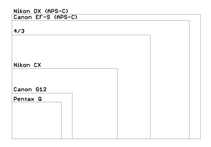
I strongly disagree. I think it was a brilliant choice. Look at this table of sensor sizes:

Sensor Area (mm^2) Stops
Pentax 645 (medium format) 1452 3.6
35mm (“full frame”) 864 2.9
APS-C (Canon) 329 1.5
4/3 225 1.0
Nikon CX 116 0.0
1/1.7″ (Canon G12) 43 -1.4
1/2.3″ (Pentax Q) 28 -2.0

All else being equal, light sensitivity is proportional to the area of the sensor. There’s a big gap between sensor sizes of compact cameras (1/1.7″ and below) and “DSLR” sensors (4/3″ and bigger). The CX sensor size is smack in the middle. It allows lenses and cameras much smaller, lighter, and cheaper than do APS-C or larger formats, but with a vast image quality improvement over compact sensor cameras – a full 2 stops better than the (tiny sensor) Pentax Q.

Camera size is really important – if the camera is too bulky to take with you, you’re not going to get any pictures at all. Yet we want quality images, so we have to compromise.

When image quality is all-important, there are plenty of DSLRs on the market for that. And if size is all that matters, there are plenty of cameras the size of a deck of cards (as well as mobile phones with cameras). But the Nikon 1 offers a unique compromise.

Unfortunately Nikon didn’t exploit this very well when designing the (four) lenses available in CX format – they’re hardly any smaller than Micro 4/3 lenses. But that’s not the fault of the sensor choice. And lens design is far from Nikon’s worst mistake here.

FLANGE FOCAL DISTANCE AND LENSES

The 1″ sensor format is also a good match for the image circle produced by many classic cine and video lenses. Many really interesting lenses meant for 16mm cinema film, or for broadcast television sensors are available on eBay. And these lenses can be easily adapted to the CX mount, while still focusing to infinity, because the CX mount has the smallest flange focal distance of any digicam on the market (excepting the Pentax Q). At just 17.0 mm, any lens designed for a longer flange distance can be easily adapted: C-mount film and video lenses, the Fuji X mount lenses (X-Pro1; 17.7 mm), Sony E mount (NEX; 18.0 mm), Micro 4/3 (19.3 mm), Samsung NX (25.5 mm), RED ONE (27.3 mm), Leica M (27.8 mm), M39 (Leica screwmount; 28.8 mm), Contax G (38.7 mm), Canon FD and FL, Minolta SR, Canon EF-S and EF, Minolta/Sony A mount, M42, and Nikon F mount – just to name some of the more popular ones.

NIKON SHOOTS ITSELF IN THE FOOT

The ability to use all these different lenses is unique to the Nikon 1 (again, the Pentax Q excepted). But did Nikon make the J1/V1 an attractive platform for these lenses? No, just the opposite. The firmware turns off all modes except full manual when any manual lens is mounted. Even the light meter is disabled. Worse, when any manual lens is mounted, the “focus assist” mode – where the central part of the image is magnified to make critical manual focusing possible – is disabled. Yet it is precisely these manual-focus lenses that need this function!

Think about that. Some Nikon firmware engineer wrote code specifically to turn off the focus assist and light meter that were already there.

They’re selling a camera that can mount more classic and exotic lenses than any other in the world, but they deliberately spent effort to make it difficult to use those lenses. And this wasn’t done to “protect” some other, more expensive, camera that has that feature – they don’t offer one. WTF, Nikon? Are you trying to make this camera fail?

A BRILLIANT SENSOR BY APTINA

But let’s go back to the positives. The camera has what I think is the only phase-detect focus system on a mirrorless camera on the market; this lets it focus fast, even during video.

Nikon also made a brilliant choice in their sensor supplier – Aptina. The Aptina sensor has super high speed readout, which makes possible a fast all-electronic shutter with no moving parts. And that enables features no other camera on the market can touch:

  • Absolutely silent shutter operation
  • Shutter speeds as short as 1/16,000 second (freezes motion like no other camera!)
  • Full 10 MPixel output at 60 frames/second (!)
  • Smaller resolutions at up to 1200 fps
  • Almost no “rolling shutter” effect

Read the rest of this entry »

About date formats

The general problem with numeric date formats is this – what does “04.07” mean? Is it July 4th or April 7th? Or April 2007? Maybe July 2004?

The answer is it’s ambiguous unless you have some other clues.  In general the separator is the clue; a dot (.) means it’s in Euro order (Day;Month;Year).  A slash (/) means it’s in USA order (Month;Day;Year) and a dash (-) means it’s in international (also Asian) order (Year;Month;Day).

So in general – don’t use MM.DD.YY date format ever.  That is confusing because DD.MM.YY (with dots) is one of the standard date formats in Europe, and MM/DD/YY (with slashes) is the most common format in the USA.  So using dots (European) with the USA order Month-Day-Year is doubly confusing.

If you must use USA order, use slashes (/) to help identify it.  If you’re going to use a Euro format, use the one that spells out the month (20 Jul 1969); at least it’s unambiguous.

Best of all is to use the ISO 8601 international format: YYYY-MM-DD.

For example, use 1776-07-04.

The dashes and the 4-digit year coming first indicate clearly that it’s in neither the Euro formats (04.07.76 or 4 July 1776) nor the USA formats (7/4/76 or July 4, 1776).

The ISO international format also has the advantage that it sorts correctly in a computer (dates will get sorted chronologically); neither the Euro nor USA formats do that.

The ISO format also happens to be the same format used in Japan & China, but that’s just a coincidence.

In general writing (when sorting order doesn’t matter) you can avoid the whole problem if you spell out the date instead of using numbers:

4 July 1776
July 4, 1776

These are both completely clear and unambiguous.

The only good patent is an expired patent

…indeed the best thing about patents is that they eventually expire. (And I say this as an inventor with multiple issued patents.)

See, for instance, http://news.cnet.com/8301-10784_3-57374941-87/litigation-lunacy-silicon-valleys-lost-its-collective-mind/?part=rss&subj=news&tag=2547-1_3-0-20.

Or http://en.wikipedia.org/wiki/Nest_Labs#Litigation.

And in general: http://www.techdirt.com/.

Having said that, I guess I have to also say that I’m not against patents in principle, only in practice.

I usually try to stay out of politics on this blog, but this affects us nerds in particular.

If we could somehow have a working patent system that limited patents to truly original and (above all,) non-obvious inventions, ideally ones that involved genuine investment (instead of off-the-cuff ideas), then I’d be in favor of that. But the current system is supposed to do that already, and fails miserably.

The result is worse than no patent system at all. Ironically, the current patent system, which is supposed to encourage innovation, instead stifles it – the risk of company-killing lawsuits over genuinely independent inventions (and therefore, in my book, obvious ones) far outweighs any encouragement.

In my view, to qualify as non-obvious, an applicant should be required to show that her invention solves a long-standing (not recent) problem which other people have had ample opportunity to solve, but have been unable to. Too many modern patents are obvious solutions to new problems which either never existed before (because a new technology raises new problems) or which only recently became solvable because of new technology. For example, sending voice over the Internet is obvious once you have an Internet. Nobody should get a patent on that just because they were the first, as this is obvious. Heatsinking a LED for domestic lighting is obvious – no patent should issue simply on the basis that nobody did it before, as that is because LED use for domestic lighting is a new application, and therefore the problem never came up before.

Apparently somebody was issued a patent on using a rotating mirror to scan a laser in a polymer 3D printer – because it’s a “new application” of the invention of the rotating mirror. There’s at least one guy who therefore is using a rotating prism instead, to work around the patent. In his own words “even though this would have been obvious for any bachelor physics student looking into this topic”. Using a rotating mirror (or prism) this way is not in any sense “invention” – it’s workaday engineering.

Solutions should be considered obvious if they appear very quickly after appearance of the problem, or if multiple independent “inventors” come up with the same solution over a short period of time.

While I’d prefer real reform of the patent system along these lines – which would reject 98%+ of currently issued patents (including most of mine) – political reality seems to make that unlikely. Given the choice between the current system and no patent system at all, I’d choose none.

How to descale a Bosch Tassimo coffee machine


This is another post tagged “sad”.

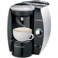
Does your circa 2009 Bosch Tassimo coffee machine have the red descaling light on? And the red light won’t turn off, even tho you followed the descaling instructions in the manual? (It should look like this:)

The problem is the manual is wrong. I don’t know how they managed it, but it’s plain wrong.

Here’s what to do:

  1. Take out the water filter from the water tank (if you have one). Descaling won’t work with the filter in there.
  2. Mix up 500 mL of descaling solution in the water supply bucket. You must have at least 500 mL of solution in there or it will run out and you’ll have to start over.
  3. Put the cleaning disc into the machine and close the little disc door.
  4. Put a cup that will hold at least 500 mL into the machine (you will probably want to take out the cup stand to make room for it). If the cup won’t hold 500 mL, it’ll overflow and you’ll have a mess.
  5. This is the key: press and hold the brew button for at least 3 seconds. Now wait 20 minutes.

After 3 seconds the green and red lights will start flashing simultaneously – that indicates you’ve started the descaling cycle, which will run 500 mL of the solution thru the machine and into the cup. It goes slowly, in small bursts over about 20 minutes. When it’s done, the red light will go out. Then flush out the machine by running lots of clean water thru it (per the manual), and put back the water filter (if you want, and if your model has one).

If you stop the machine before it’s done with the full cycle, you’ll have to start over.

This procedure is hinted at in icon-speak (no words) on the little booklet that the cleaning disc comes in. It’s totally different from what the manual says, with the key difference that this procedure works.

Enjoy your coffee.


Is MS Word 2003 loading slower and slower?

It was for me. Turned out that that my Normal.dot file, usually 38 kBytes, had grown to 1.4 MBytes. That’s what was taking so long – loading it each time.

Simply deleting the file was a good temporary fix back in May (Word automatically re-creates it if it’s missing). On Win7 for me it was in:

C:\Users\Dave\AppData\Roaming\Microsoft\Templates

Lately, it’s been happening again – this time Normal.dot had grown to 1.8 MBytes (since May!).

Investigation revealed that the file grew by about 2 kBytes each time I loaded a file. I had a look at the binary of Normal.dot to see what was taking up so much space, and saw lots of Unicode text reading things like “Sign in to Office Live Workspace beta”.

So I un-installed “Microsoft Office Live Add-in”. Now Normal.dot doesn’t grow anymore.

This post is tagged “Sad”.

Quickbooks label-printing workaround

Intuit is a frustrating company to deal with.

If you’re using Quickbooks 2008 or 2009 on Windows 7 and attempt to print a shipping label using the built-in Shipping Manager app (a FedEx label, anyway), it won’t print.

You get an error message something like:

Unable to print label: Thermal printer

And the name of the printer in the printer dialog box has a bunch of garbage including a couple of UUIDs.

I suspect this is one of Intuit’s not-so-subtle ways of getting you to upgrade. When I called in for my activation code, the nice Indian lady on the phone told me that QB 2008 is going to crash my Win7 computer when I least expect it, so I’d better upgrade right now.

Anyway – here’s the workaround:

Install a trial version of Quickbooks 2010 (any version, doesn’t matter). In that version, go into Shipping Manager (Create Invoice>Ship) and let it upgrade. Setup and test your printer in it.

After that, you can un-install the QB2010 and the upgraded Shipping Manager will print labels just fine.

Am I the only one who thinks this is funny?

The Economist, 2009-09-12, US Edition (Georgia)

The Economist, 2009-09-12, US Edition (Georgia)

Things the iPhone could learn from the Treo

As per the topic of my last post, I recently switched from a Palm Treo 650 to an iPhone 3GS.

In most ways the iPhone is far more advanced, but as a PDA the iPhone still falls short of the 7 year old Treo design.

1 – Getting to most-used apps fast

Edit 2014: The Android app “Cover” does a lot of this, altho it’s half-baked. Unfortunately they got bought by Twitter, who seem to have ended development on it.

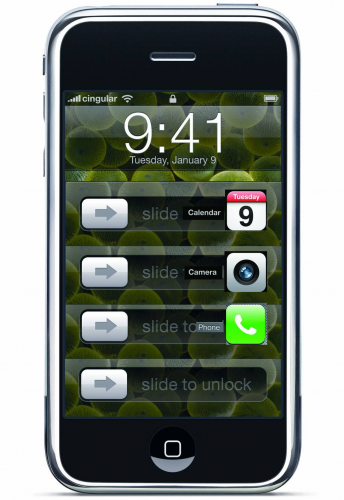
The iPhone’s UI is beautiful, but it is needlessly slow to get at often-used apps like Phone and Contacts.

On the Treo, a single button press gets you to the phone keypad.  A different single button gets you to Contacts, or any of 2 apps of your choice.  Admittedly, the Treo has many more buttons, but the iPhone could do far better.

On the iPhone, you:

  1. Press Home
  2. “slide to unlock”
  3. Press Home again (if you were previously in an app)
  4. Slide the app menu left or right a few times (if the app you want isn’t on the first menu page or the dock)
  5. Press the app you want

In the best case it’s 3 steps to your app, in the worst 5 steps.  That’s a lot of work just to start your favorite app.

But this is completely unnecessary.  Apple could easily do something like this:

iPhoneMockup2

Apple, you can do better!

(forgive the crude Photoshop work; but you get the idea).

This way you get to your favorite apps much quicker – just Home and one swipe.

Apple, if you want to do this, you have my permission – I won’t sue you.  Just ask if you want it in writing (see “About me“).

2 – Named app pages

The Treo let you name each page of apps, so you could categorize them.  And you could walk thru each page with the Home button.  I don’t see why Apple can’t do that.

3 – Contact searching

The Treo was much quicker at searching for contact entries.  It had a clever system where if you entered “db” it would search not just for names containing “db” but also for names with the initials “D.B.”.  This worked really well – just 2 or 3 letters was usually enough to identify a contact this way.

The only reasons I can think of why Apple doesn’t do this are (1) they didn’t know about it, or (2) patent issues.  But I’d think Apple and Palm are both infringing on enough of each others patents to make that moot – they’re already well into the realm of mutually-assured destruction.

4 – Telephone number selection

Again, Treo wins.

On the Treo all the phone numbers for each contact (office, home, fax, mobile, etc.) are visible on the screen.  You can directly click any one of them and dial it.

On the iPhone, you first find your contact, then select it, and only then can you choose a number to dial.  Three steps vs. one on the Treo.

5 – No casual notes in phone numbers

The Treo would happily ignore everything after the first alphabetic character in a stored phone number, so you could include casual notes like this:

+1 800 555 1212 (lake house)

+1 800 555 1213 (girlfriend’s place)

That’s a no-no on the iPhone – it will simply refuse to dial numbers that contain “invalid” characters.

There is no good substitute way to store this kind of info, which I find pretty important.

I’m very impressed with the iPhone’s capabilities, but I’m surprised how little Apple learned from what was already in the market.

In retrospect, I think I might have been better off buying the Palm Pre.  But I did want to try the “Apple experience”, and having spent two weeks getting the iPhone setup, I think I’ll let the Concorde Effect do it’s dirty work and stick with the iPhone for a while.

At least until my contract with AT&T is up.

Naked proton

Two hydrogen atoms meet.

One says, ‘I’ve lost my electron.’

The other says ‘Are you sure?’

The first replies, ‘Yes, I’m positive.’